

Have you ever painted your nails a shade that looked stunning in the bottle, only to find it made your hands look washed out or oddly red? You are not imagining things. The culprit is usually temperature: the polish was a warm tone, and your skin leans cool, or the other way around. Cool nail polish colors sit on the blue, green, and violet side of the color wheel, and they behave very differently on the hand than the peach, coral, and orange shades that dominate drugstore displays.
This guide breaks down what makes a color cool, which cool shades work best across the seasons, how to match them to your skin’s undertone, and the practical mistakes that make even a beautiful blue-gray polish look wrong. No vague color-wheel mysticism, just the details that matter when you are standing in an aisle trying to decide.
What Makes a Nail Polish Color “Cool”?
In color theory, cool colors are the hues clustered around blue and green, including blue-violet, teal, and most grays that carry a blue cast. Warm colors sit opposite them: reds, oranges, and yellows. This is a long-standing convention in art and design rather than a formal scientific standard, but it is consistent enough to be useful when shopping.
The tricky part is that almost no polish is purely one temperature. A berry shade might be a red, but if it has a strong blue base, most people will read it as cool. A taupe can look gray and cool in the bottle and turn muddy and warm on the nail. The base pigment, not the marketing name, decides how a shade behaves.
Cool polishes tend to share a few visual traits:
- Blue or violet undertones that give the color a slightly “icy” or shadowed quality
- Ash or gray mixed in, which mutes brightness and reads sophisticated rather than sugary
- A sharper contrast against warm skin, which is why a cool red can make some hands look pinker and others look sallow
That last point matters more than any label on the bottle. The same polish can look warmer or cooler depending on the lighting in the room, a phenomenon tied to how our eyes interpret color under different light sources. Fluorescent office lighting will flatten a cool lavender; warm evening bulbs will pull it toward pink. If a shade looks off in the store, take it to a window before you commit.
The Cool Color Families Worth Knowing
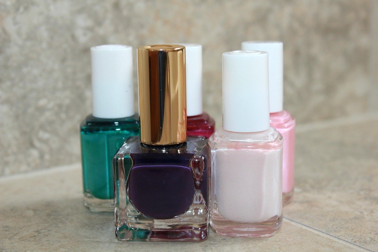
Cool tones are not one palette. They split into several families, each with a different personality and level of difficulty.
| Family | Examples | Best for | Watch out for |
|---|---|---|---|
| Cool blues | Periwinkle, powder blue, navy | Most undertones, especially fair skin | Pale blues can wash out very pale hands |
| Cool greens | Mint, sage, teal, emerald | Medium and deep skin tones | Yellow-based greens turn warm and clash |
| Blue-violets | Lavender, lilac, plum | Cool and neutral undertones | Can read gray on olive skin |
| Cool reds and berries | Raspberry, blue-red, cherry | Nearly everyone | Orange-reds are warm, not cool |
| Cool neutrals | Blue-gray, taupe with violet base, icy nude | Everyday wear, office settings | “Greige” shades can go muddy |
Cool blues had a genuine moment in the mainstream when periwinkle was named a color of the year for 2022, a pick that pushed blue-toned shades into everything from fashion to nail aisles. That kind of annual announcement is one reason cool palettes keep resurfacing rather than staying niche.
If you want a softer entry point, sheer finishes are forgiving because they let your natural nail color show through and blend with your skin. Browsing sheer nail polish options is a low-risk way to test whether a cool lavender or icy pink suits you before buying a full-coverage bottle.
How to Match Cool Shades to Your Skin Undertone
The most common advice in beauty writing is that cool polish flatters cool undertones. Treat that as a helpful heuristic, not a rule carved in stone. There is no body of research proving that matching temperature guarantees a flattering result. It is styling convention, and conventions are starting points.
Still, the convention is useful. Here is how it usually plays out in practice:
- Check your veins. Blue or purple veins usually suggest cool undertones; greenish veins suggest warm. If you see a mix, you are likely neutral.
- Try the jewelry test. Silver tends to look brighter against cool skin, gold against warm.
- Test on two nails, not one. Paint a cool shade and a warm shade side by side and look at them in daylight. The one that makes your skin look even, rather than red or gray, is your answer.
- Ignore the bottle. Judge only what the color does to your hand.
People with neutral undertones have the widest range and can wear cool and warm shades with equal ease. Olive undertones are the trickiest group: a cool lavender can turn ashy against olive skin, while a cool teal or deep plum tends to look rich. Very fair skin can handle icy blues and pale lilacs that would look chalky on deeper tones, while deep skin tones carry saturated emerald, cobalt, and blue-violet beautifully because the contrast is lower and the pigment reads clearly.
Cool Shades by Season
Polish trends move with the calendar, and cool tones shift their character from one season to the next. Seasonal palettes are announced by forecasting bodies and trade shows rather than fixed by any authority, so treat any specific list as a snapshot rather than a permanent truth.
Spring
Spring is where cool tones get light and airy. Think pale lilac, baby blue, mint, and cool-toned pastel pink. The mistake people make here is going too pale against pale skin, which erases the contrast that makes a manicure look intentional. If a pastel disappears on your hand, step one shade deeper rather than adding a second coat of the same color. The full range of spring nail colors leans pastel, so this is the season to experiment cheaply.
Summer
Summer pushes cool shades toward brightness: cobalt, turquoise, and vivid aqua. These are the shades that photograph well and hold up against sunburn and chlorine. A practical tip: bright cool blues show chips more than any other family, so a good top coat matters more than the base color here.
Fall
Autumn is the season cool tones get moody. Plum, berry, slate blue, and deep teal replace the brights. This is where cool-leaning people finally get their moment, because fall palettes are traditionally built on warm rust and amber. If warm autumn shades make your hands look red, the cool end of the fall nail colors spectrum, like a blue-based burgundy, is your alternative.
Winter
Winter is the natural home of cool polish: icy blue, silver-gray, deep navy, and blue-toned red. Holiday reds are a classic example of temperature mattering. A blue-red looks crisp and elegant on cool skin, while an orange-red can look jarring. Explore the cooler end of winter nail colors if you want shades that feel seasonal without going full festive glitter.
Nudes and Neutrals: The Cool Versions
Nude polish is where temperature mistakes happen most often, because “nude” is not a color, it is a category. A nude that matches your skin perfectly will look seamless; a nude that is two shades too warm will look like a stain.
Cool nudes lean pink, mauve, or gray rather than peach or beige. A classic example is the pale, slightly cool-toned milky shade that has become a staple in salon requests. If you have been hunting for that specific look, the opi funny bunny nail polish shade is a well-known reference point for a cool-leaning sheer nude, and it is a useful benchmark when comparing other brands.
Cool neutrals are also the most forgiving choice for anyone who wants a polished look at work without a visible “color.” A blue-gray or a mauve-taupe reads as neutral from a distance but gives the hand a subtle lift that a flat beige cannot. The broader world of nude nail polish is worth browsing with temperature in mind rather than just shade depth.
Cool Colors in Special Finishes
Temperature does not only apply to creme polishes. Finishes change how a cool shade reads, sometimes dramatically.
Shimmer and metallic cool shades look almost liquid: silver, ice blue, and blue-violet chrome finishes catch light and make the nail look dimensional. The downside is that shimmer highlights ridges and imperfections, so a ridge-filling base coat earns its keep here.
Magnetic polish is a special case. A magnetized polish creates a cat-eye effect, and cool-toned versions of this finish are especially striking because the light band reads as a bright streak against a dark blue or violet base. If you have never tried it, understanding how magnet nail paint magnetic polish creates cat eye effect will save you from the common mistake of holding the magnet too far from the nail, which produces a weak, blurry line instead of a sharp one.
Matte top coat mutes a cool shade and pushes it grayer. This works beautifully on slate blue and deep teal but can make pale lilac look dusty and dull. Test on one nail before committing to all ten.
Practical Mistakes That Make Cool Polish Look Wrong
Even a well-chosen cool shade can disappoint, and the reasons are usually practical rather than aesthetic.
- Skipping base coat. Cool blues and greens are the classic staining culprits. A base coat is not optional with these pigments unless you enjoy yellow nails for a month.
- Judging color indoors. Store lighting lies. Always confirm in daylight.
- Applying too many thin coats of a sheer shade. Sheers build unevenly. Two careful coats beat five thin ones.
- Ignoring your hands’ natural color. Cool polish amplifies pink or red in the skin. If your hands flush easily, a cool blue-violet can make that flush more obvious; a cool gray-blue is gentler.
- Overlooking cuticle condition. Cool tones are unforgiving around dry, red cuticles because the contrast is high. A minute with cuticle oil changes the whole result.
- Assuming “cool” means “blue.” A blue-based red, a violet-leaning plum, and a green-tinged charcoal are all cool. Narrowing cool to blue cuts your options in half.
One more practical note on formulation: labels like “3-free,” “5-free,” and “10-free” refer to leaving out certain ingredients such as toluene, formaldehyde, and dibutyl phthalate. These are marketing terms rather than a regulatory standard, so they are not a guarantee of anything beyond the specific ingredients listed. If ingredient content matters to you, read the label rather than trusting the front of the bottle.
Common Myths About Cool Shades
A few beliefs about cool polish deserve a gentle correction.
Myth: Cool polish only suits cool skin. Not true in practice. Deep skin tones and neutral undertones can wear cool shades beautifully. The rule is a shortcut, not a law.
Myth: Cool colors are only for winter. Cool tones span the full year. Mint and powder blue are quintessential spring shades, and turquoise is a summer staple.
Myth: Cool means cold and unfriendly. A cool rose or a soft mauve is as warm-feeling as any peach. Temperature describes the pigment’s base, not its mood.
Myth: If it looks bad in the bottle, it will look bad on you. The opposite happens constantly. A gray-looking lavender can turn luminous on the right hand, and a gorgeous bottle can fall flat once applied.
Conclusion
Cool nail polish colors are less about following a trend list and more about understanding what you are looking at. Blue, green, and violet-based shades behave differently from warm ones, and the difference shows up most clearly on the hand rather than in the bottle. Match the temperature to your undertone as a starting point, test in daylight, use a base coat with staining pigments, and let the season guide the intensity rather than the decision itself. Whether you land on an icy blue for January, a mint for April, or a blue-based burgundy for October, the shade that makes your skin look even is the one worth keeping.
FAQ
What are cool nail polish colors?
Cool nail polish colors are shades built on blue, green, or violet bases. That includes blues, teals, mints, lavenders, blue-reds, berries, and grays with a blue cast. The base pigment, not the name on the bottle, decides whether a shade reads cool.
Do cool colors suit warm skin tones?
They can, though the match is less automatic than with cool undertones. Warm-skinned people often do best with cooler shades that still have some depth, such as teal, blue-violet, or a blue-based red, rather than pale icy pastels that can look chalky.
What is the difference between cool and warm nail polish?
Cool polish has blue or green undertones and tends to look crisp, icy, or shadowed. Warm polish has red, orange, or yellow undertones and reads golden or sunlit. Many shades sit in between, which is why testing on your own hand beats guessing.
Are cool-toned polishes better for pale skin?
Pale skin usually handles icy blues, lilacs, and cool pinks well because there is enough contrast. The risk is going too pale, which erases contrast and makes the hand look washed out. Stepping one shade deeper usually fixes it.
Why does my cool polish look different at home than in the store?
Lighting changes how color is perceived. Store fluorescents flatten cool tones, while warm indoor bulbs pull them toward pink or purple. Daylight is the most reliable way to judge a shade, so check your nails near a window before deciding.
Do cool polishes stain nails more than warm ones?
Blues and greens are the most common staining pigments, so a base coat is essential with these shades. Warm reds can stain too, but cool blues and teals are the usual offenders. Two coats of base under a deep blue is cheap insurance.