
What makes an illustrator’s work instantly recognizable, even before you spot the signature? For a certain corner of the design world, the answer is watercolor washes, heraldic crests, and a playful tension between old-world elegance and modern wit. That combination belongs to Happy Menocal, an American artist whose paintings and paper goods have quietly shaped how a generation of hosts, brides, and brands think about illustration.
This article looks at who she is, what defines her style, where her work shows up, and why her approach matters to anyone interested in illustration, stationery, or personal style. It also covers practical lessons you can borrow from her method, whether you are commissioning art or making your own.
Who is Happy Menocal?
Happy Menocal is an American illustrator and artist known for watercolor and ink work. Her practice spans fine art, editorial illustration, and a line of paper goods, including stationery, invitations, and gift items. She is closely associated with a style that blends classical and heraldic motifs with loose, expressive watercolor. Think crests, ribbons, animals, and ornamental frames, rendered with a lightness that keeps them from feeling stiff.
A few things are worth flagging up front. Public details about her biography, training, and career timeline are not consistently documented in one place, and reliable specifics are hard to pin down without checking primary sources. Rather than guess at dates, exhibitions, or collaborations, this piece focuses on what can be described with confidence: the character of her work, the categories it falls into, and the way her style functions. Readers who want exact biographical facts should look to the artist’s own published materials and gallery or publisher pages.
What is clear is her position in the design conversation. Menocal belongs to a group of illustrators who moved watercolor and hand-drawn ornament back into mainstream taste, particularly in the worlds of weddings, interiors, and lifestyle branding. Her work sits at a useful intersection: decorative enough for a dinner invitation, sophisticated enough for a magazine page, and personal enough to feel like a gift rather than a template.
The Signature Style: Watercolor Meets Heraldry

The first thing most people notice about Menocal’s work is the tension between control and looseness. Watercolor is unforgiving. It blooms, bleeds, and dries however it wants. Heraldry, by contrast, is all rules: specific shapes, specific arrangements, specific meanings. Marrying the two is harder than it looks.
Her approach typically involves a few recurring moves:
- Loose washes that let color pool and fade rather than sit flat
- Ink or fine line work that gives structure to organic shapes
- Classical references, including crests, ribbons, banners, and frames
- Animal and botanical subjects, often treated with gentle humor
- Generous white space, which keeps busy ornament from feeling crowded
That last point matters more than people realize. Decorative illustration fails when every inch is filled. The best examples in this tradition leave room to breathe, and that restraint is a big part of why the work reads as elegant rather than fussy.
There is also a personality to it. A crest with a slightly absurd animal, a ribbon that curls a little too far, a wash that spills past its outline: these are small jokes. They signal that the artist is having fun, and that the viewer is invited to as well.
Where the Work Shows Up
Menocal’s output falls into a handful of recognizable categories. Each one has its own constraints, and understanding those constraints helps explain why the work looks the way it does.
| Category | Typical Use | What It Demands |
|---|---|---|
| Fine art and painting | Personal collections, gallery contexts | Originality, consistency of voice |
| Editorial illustration | Magazines, digital features | Speed, clarity at small sizes |
| Stationery and invitations | Weddings, parties, personal correspondence | Reproduction quality, personalization |
| Brand and packaging work | Lifestyle and design companies | Flexibility across formats and materials |
| Paper goods and gifts | Retail, gifting | Charm, durability, price sensitivity |
The stationery category deserves special attention. Invitations and personal correspondence are where illustration meets real life. A design has to survive printing, envelope sizes, postal handling, and the deeply personal taste of whoever is sending it. Illustrators who succeed in this space tend to be good collaborators in addition to being good painters.
Editorial work pulls in the opposite direction. A magazine page needs an image that reads in a fraction of a second, often at thumbnail size on a phone. Fine detail gets lost. Strong silhouettes and clear color do the heavy lifting. An artist who can move between these two modes, as Menocal does, is doing something genuinely difficult.
Why This Aesthetic Resonates Now
The broader revival of hand-painted, ornamented illustration is not an accident. Several forces pushed it forward.
First, digital fatigue. When everything on a screen looks slick and identical, visible brushstrokes feel like a luxury. Watercolor signals a human hand at work, and that signal has real value in a crowded visual field.
Second, the personalization boom. Weddings, milestone parties, and gifting have all moved toward custom and semi-custom design. Crests and monograms fit this perfectly. They turn a generic object into something that belongs to one person or one family, and they photograph beautifully, which matters in an era when every event is documented.
Third, the interior design shift toward layered, collected spaces. A framed watercolor crest or a set of illustrated note cards fits naturally into rooms that mix antiques with contemporary pieces. The aesthetic is warm, a little nostalgic, and easy to live with.
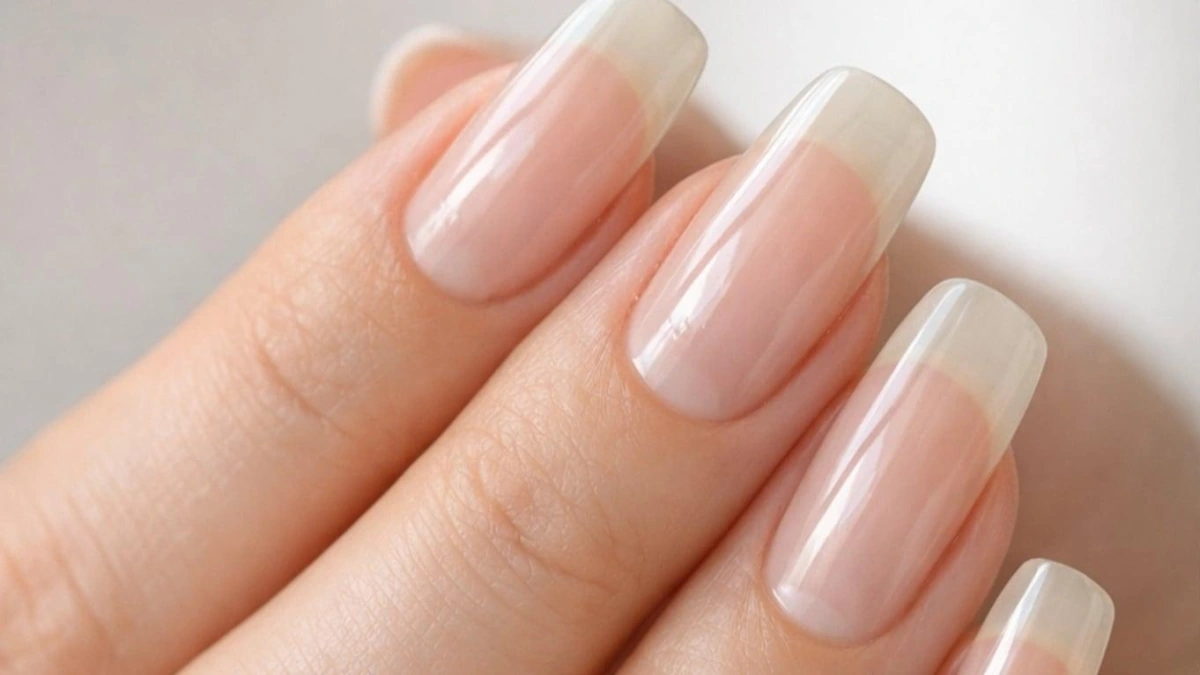
For anyone browsing for inspiration, there is a whole genre of cheerful, color-forward nail art that borrows from the same playful mood, and collections of happy nail ideas show how far the “cheerful and hand-made” instinct has spread beyond paper. The same impulse that makes a watercolor crest appealing shows up in small, personal, decorative choices everywhere.
What Makes the Style Work: Practical Lessons
If you are commissioning illustration, building a brand identity, or trying this aesthetic yourself, a few principles from this body of work are worth borrowing.
Start with structure, then loosen it
The looseness in Menocal’s work is not chaos. It is built on a solid underlying drawing. The wash goes where the form needs it. If you are making your own, sketch the shape carefully first, then allow yourself freedom in the painting stage. Skipping the structure produces mush, not charm.
Choose a limited palette
Watercolor gets muddy fast. Limiting yourself to a small set of harmonious colors keeps images clean and makes a series feel cohesive. This is especially important for stationery, where a suite of pieces needs to look like a family.
Let white space do work
Resist the urge to fill the page. Empty space is a design element, not a failure. It creates focus and makes ornament feel intentional.
Repeat motifs across a set
A crest, a ribbon, a particular flower: repeating a motif across invitations, menus, and thank-you cards builds a visual language. It also makes production easier and cheaper.
Test at final size
This is the mistake people make most often. An illustration that looks wonderful on a large screen can turn to noise on a small card or a phone screen. Always check the design at the size it will actually appear, and simplify until it reads clearly.
Common Mistakes to Avoid
Beyond sizing, a few pitfalls show up again and again in decorative illustration and stationery design.
- Over-decorating. More ornament does not mean more elegance. Editing is the harder and more valuable skill.
- Ignoring reproduction. Screen colors and printed colors differ. Metallic inks, textured paper, and letterpress all change how an image reads. Plan for the final material early.
- Chasing trends too closely. A style that is everywhere this year can feel dated in three. Personal voice ages better than a palette.
- Skipping the brief. Custom work succeeds when the artist understands the occasion, the audience, and the constraints. Vague direction produces vague results.
- Forgetting the practical details. Envelope sizes, postal regulations, and print margins are unglamorous and absolutely decisive.
None of these are reasons to avoid the aesthetic. They are simply the difference between work that looks charming in a portfolio and work that holds up in someone’s hands.
Building a Cohesive Look Around Illustrated Art
One reason Menocal’s style has staying power is that it extends outward so easily. A crest or watercolor motif can anchor an entire visual identity: a wedding suite, a small brand, a personal stationery wardrobe, even a party theme. The trick is consistency without repetition.
A useful approach is to pick one anchor motif and vary everything else. Keep the crest shape the same, but change the colorway for different pieces. Keep the palette, but change the subject. This gives a set a family resemblance without making every item identical.
For readers who enjoy assembling a look across categories, the same logic applies to color and pattern in general. Exploring happy nail designs is a low-stakes way to experiment with palettes and motifs before committing them to paper or print. If you like a combination on a small canvas, it will usually hold up on a larger one.
There is also a seasonal angle. Illustrated paper goods move in cycles: spring pastels, summer brights, autumn earth tones, winter metallics. Planning a set across a year rather than a single event keeps the work fresh and gives you more chances to reuse motifs.
Commissioning Illustrated Work: What to Expect
If you are considering hiring an illustrator in this tradition, a little preparation goes a long way.
- Define the occasion and audience. A wedding invitation and a corporate gift card need very different tones.
- Gather references. Show examples of styles you like, and be specific about what you like in each.
- Confirm the deliverables. How many pieces, what sizes, what file formats, and who owns the artwork?
- Discuss the production path. Printing method, paper stock, and timeline all affect the design.
- Build in revision rounds. Most illustrators include a set number of revisions. Use them wisely and consolidate feedback.
- Leave room for the artist’s voice. The reason to hire an illustrator is their perspective. Over-directing produces something generic.
The best commissions feel like a conversation. The client brings the occasion, the constraints, and the taste; the artist brings the hand and the interpretation. When that balance is right, the result is something neither party could have made alone.
The Broader Influence
Beyond individual commissions, this kind of work has shaped how a whole category looks. Crests, monograms, and watercolor botanicals now appear on everything from wedding suites to skincare packaging to restaurant menus. The style has become a shorthand for warmth, heritage, and personal touch.
That ubiquity has a downside. When a look is everywhere, it can start to feel like a default rather than a choice. The artists who endure are the ones with a distinct hand, and that is the real lesson here. Techniques can be copied. A point of view cannot. Menocal’s work stands out not because watercolor and heraldry are unusual in isolation, but because the combination carries a specific sensibility: classical forms treated with lightness and humor.
For anyone building a visual identity, whether personal or commercial, that is the takeaway worth keeping. Find the tension that interests you, whether it is old and new, strict and loose, or formal and funny. Then commit to it consistently. A style built on a genuine point of view will outlast any single trend, and it will be far more satisfying to make.
If you want a broader starting point for cheerful, color-driven inspiration across categories, a look at happy nails shows how the same instincts play out in a completely different medium, and guides like 10 happy nails ideas: colors and designs to try offer concrete combinations you can adapt to paper, packaging, or party palettes.
Conclusion
Happy Menocal occupies a distinctive place in contemporary illustration: an artist whose watercolor and ink work bridges fine art, editorial pages, and the everyday objects people actually use. Her signature blend of classical heraldry and loose, expressive painting has helped push hand-drawn ornament back into mainstream design taste, particularly in stationery, weddings, and lifestyle branding.
The practical lessons are portable. Build structure before you loosen it. Limit your palette. Let white space work. Test at final size. Avoid over-decorating. And above all, protect the point of view that makes the work yours. Whether you are commissioning a crest for a celebration, designing a small brand, or simply painting for pleasure, those principles hold up.
For readers who want to dig deeper, the most reliable path is to seek out the artist’s own published materials and the galleries, publishers, and design outlets that have featured her work. Biographical specifics are best confirmed at the source, while the visual language itself is available to anyone willing to look closely and then try it themselves.
Frequently Asked Questions
Who is Happy Menocal?
Happy Menocal is an American illustrator and artist known for watercolor and ink work. Her practice includes fine art, editorial illustration, and a line of paper goods such as stationery, invitations, and gifts. She is especially associated with a style that combines classical and heraldic motifs with loose, expressive watercolor painting.
What is Happy Menocal known for?
She is best known for a distinctive visual style: watercolor washes paired with fine line work, often featuring crests, ribbons, ornamental frames, animals, and botanical subjects. That style has appeared across stationery, editorial illustration, and brand and packaging work, and it has influenced how decorative illustration looks in wedding and lifestyle design.
What defines her artistic style?
The defining feature is tension between control and looseness. Watercolor is unpredictable, while heraldry is rule-bound, and her work sits where those two meet. Recurring elements include loose washes, structured line work, classical references, gentle humor, and generous use of white space that keeps ornament from feeling crowded.
Why is this aesthetic popular right now?
Several factors converge. Digital fatigue has made visible brushstrokes feel valuable, personalization has pushed weddings and gifting toward custom crests and monograms, and interior design has moved toward layered, collected spaces where framed watercolor art fits naturally. The style also photographs well, which matters in an era of heavily documented events.
How can I commission illustrated work in this style?
Start by defining the occasion and audience, then gather specific references showing what you like. Confirm deliverables, sizes, file formats, and artwork ownership up front. Discuss printing method and paper stock early, since these affect the design. Build in revision rounds, consolidate your feedback, and leave room for the artist’s own voice.
What mistakes should I avoid with decorative illustration?
The most common errors are over-decorating, ignoring how the design will reproduce in print, chasing trends too closely, giving a vague brief, and overlooking practical details like envelope sizes and print margins. Another frequent mistake is judging a design on a large screen instead of at the size it will actually appear.