
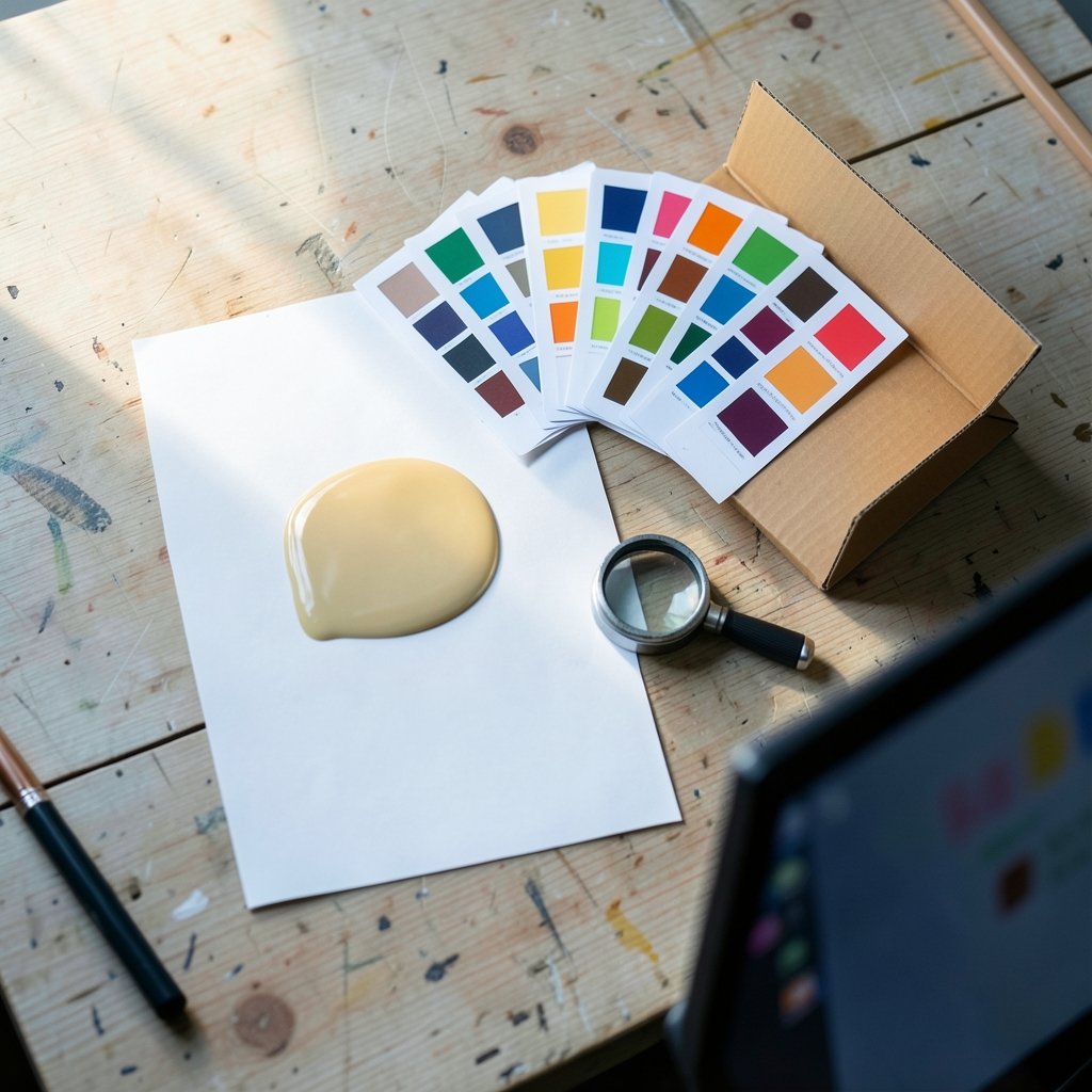
What do a grocery store endcap, a thirty-second commercial, and a color-calibrated monitor have in common? They can all be described as a “spot on display.” That single phrase hides at least four different jobs, and mixing them up wastes money. A retail buyer who thinks “spot” means a short video will order the wrong fixture. A print producer who thinks it means a shelf position will spec the wrong ink.
This article untangles the phrase by use case. It covers the retail merchandising spot, the advertising spot that runs on screens, spot color and spot varnish in display printing, and the everyday claim that a display is “spot on” for accuracy. Each section explains what the term means in practice, where people go wrong, and what actually works.
What does “spot on display” mean in retail merchandising?
In retail, a spot is a small, defined selling position. It is not a whole aisle or a department. It is a specific patch of real estate with a specific job: catch attention, hold a product, and convert a passing shopper. Common examples include endcaps, counter units, shelf-edge positions at eye level, and freestanding floor stands near a checkout.
The word matters because retail space is priced and planned by position. A display spot near the entrance is worth far more than the same square footage in a back aisle. Merchandisers talk about “owning a spot” the way media buyers talk about owning a time slot.
How a retail display spot is planned
Planning a spot is a sequence, not a single decision. Teams that skip steps usually end up with fixtures that look good in a planogram and fail on the floor.
- Define the job of the spot: impulse purchase, new product trial, promotion support, or brand awareness.
- Choose the location based on shopper traffic and sightlines, not on what space happens to be free.
- Size the fixture to the product and the aisle. Oversized units block traffic and get pulled by store staff.
- Set the replenishment plan before launch. An empty spot is worse than no spot.
- Agree on how long the spot stays. Temporary displays that outlive their promotion become clutter.
Mistakes that kill a retail spot
The most common failure is treating the spot as decoration. A display that stops shoppers but does not make the product easy to take and buy is a net loss. Shoppable beats beautiful almost every time.
The second mistake is ignoring the staff who maintain it. If a fixture is hard to restock or blocks cleaning, it quietly disappears within weeks. The third is overloading. A spot crowded with six messages communicates none of them. One clear claim, one clear product, one clear price.
For brands building a visual identity around a specific audience, the same logic applies online as in-store: knowing exactly who you are talking to sharpens every asset. That is why teams working on textured hair campaigns study references like 4c hair before designing shelf-side messaging.
What is an advertising spot on a display screen?

In advertising, a spot is a short piece of content, usually fifteen to sixty seconds. When that spot runs on a display, the display is typically a digital screen in a public or semi-public space: a retail aisle, a gym, a transit hub, a waiting room, or a lobby.
This is where the phrase gets genuinely confusing, because “spot on display” can describe both the content and the hardware. A media buyer means the creative. An installer means the screen. Both are correct in context.
Digital out-of-home and retail media
Screens in public spaces fall under digital out-of-home advertising. Screens inside stores fall under retail media, a category that has grown quickly because it reaches shoppers close to the moment of purchase. The two share a constraint that home advertising does not: viewers are standing, distracted, and often in motion.
That constraint shapes what works. Short spots with large text, high contrast, and a single idea outperform dense messaging. Sound is unreliable in public spaces, so the spot must work muted. Captions and on-screen text are not optional extras; they are the primary channel.
What actually works for in-store screen spots
Practical experience from retail media deployments points to a few consistent rules:
- Design for three seconds. The first frame must carry the message, because many viewers only glance.
- Loop sensibly. A short rotation keeps repeat shoppers from seeing the same spot four times in one visit.
- Match the screen to the environment. Bright aisles wash out dim screens. Direct sunlight ruins poorly shaded ones.
- Keep the call to action physical. “Find it in aisle 6” beats “visit our website” when the shopper is already in the store.
One more point often missed: screen placement is a merchandising decision as much as a media decision. A screen at eye level in a high-traffic zone behaves very differently from one above a shelf that shoppers never look up at.
Spot color and spot varnish in display printing
In print production, “spot” refers to ink applied in a specific, premixed formulation rather than built from the four standard process colors. A spot color is a named, exact hue. Brands use spot colors when a logo or signature shade must match precisely across every printed display, from a counter card to a floor graphic.
The reason is simple. Process printing builds color from tiny dots of cyan, magenta, yellow, and black. That works well for photographs. It struggles with vivid oranges, deep navies, and metallic or fluorescent shades. A spot ink hits the target directly.
Spot varnish and spot UV
A spot varnish or spot UV coating is applied only to selected areas of a printed piece. The rest stays matte. The result is a tactile contrast: a glossy logo on a soft-touch background, or a raised pattern that catches light as a shopper walks past.
This technique is popular on premium displays because it adds perceived quality at modest cost. It also draws the eye without adding a single word of copy. Used carelessly, though, it backfires. Heavy spot UV across a whole panel reads as glare, not luxury.
Common print production mistakes
The biggest error is approving color on a backlit monitor. Screens emit light; paper reflects it. A shade that looks rich on screen can print dull or muddy. Always approve a physical proof under the lighting the display will actually live in. (The row)
The second error is forgetting the substrate. The same spot color behaves differently on coated card, uncoated board, and recycled stock. The third is specifying spot varnish on areas that will be handled, scuffed, or stacked. Coatings wear, and worn coatings look cheap.
| Print method | Best for | Watch out for |
|---|---|---|
| Process (CMYK) | Photos, gradients, complex art | Weak vivid and metallic shades |
| Spot color | Exact brand hues, logos | Higher cost, extra press setup |
| Spot varnish or UV | Texture, selective gloss | Glare, wear on handled areas |
When “spot on” means accuracy
Outside retail and print, “spot on” is plain English for accurate. Applied to a display, it usually means the screen shows color and brightness the way the source intended. This matters in photo editing, video production, medical imaging, and any workflow where a designer and a client must agree on what they are looking at.
What makes a display accurate
Accuracy is not the same as looking impressive. A screen in a showroom is often tuned for punch: oversaturated color, high contrast, boosted brightness. That sells televisions. It does not help anyone judge an image.
A genuinely accurate display is calibrated to a known reference, typically a standard color space and a defined white point and gamma. Calibration is a measurement process, not a menu preset. The difference shows up immediately when two screens sit side by side.
Practical steps that make a real difference:
- Let the display warm up before measuring. Color drifts in the first thirty minutes.
- Calibrate in the lighting conditions the work will be viewed in.
- Recheck periodically. Panels shift as they age.
- Keep a reference print or a second calibrated screen for cross-checks.
Where the phrase causes real confusion
Because the term spans four domains, miscommunication is common. A quick way to avoid it is to ask one clarifying question: is the “spot” a place, a piece of content, an ink, or a claim about accuracy?
In retail meetings, “spot” almost always means position. In media meetings, it means creative. In production meetings, it means ink or coating. In technical meetings, it is an accuracy claim. Getting this wrong at the briefing stage costs far more than getting it wrong later.
There is also a seasonal dimension. Retail display spots rotate heavily around peak shopping periods, and planning calendars for campaigns like the best winter vacation spots promotions often lock in fixture space months ahead of the season. Teams that book display positions late pay more and get worse locations.
How to brief a display project without ambiguity
The single most useful habit is to name the type of spot explicitly in every brief. Instead of “we need a spot on display,” write “we need an endcap position in the cereal aisle for eight weeks” or “we need a twenty-second muted video spot on the aisle screen” or “we need a spot color match plus spot UV on the logo panel.” Specific language removes guesswork.
A second habit is to define success before design starts. For a retail spot, that might be units sold per week. For a screen spot, it might be recall or lift in the surrounding category. For a print piece, it is color approval on the first proof. For a calibrated display, it is a measured match to reference. Without a defined measure, “spot on” becomes an opinion.
A third habit is to walk the physical space. Plans and renderings hide problems: a pillar blocking sightlines, a freezer humming beside the fixture, a screen angled away from foot traffic. Ten minutes on site prevents months of poor performance.
Finally, build in a review point. Display spots, screen rotations, and print runs all benefit from a mid-campaign check. What looked right on paper often needs one adjustment once real shoppers, real lighting, and real handling enter the picture. Teams that plan for that adjustment get far more from the same budget.
Conclusion
“Spot on display” is a small phrase carrying four different jobs. In retail, it is a defined selling position that must be planned, stocked, and maintained. In advertising, it is a short piece of creative built for distracted viewers and muted screens. In print, it is a precise ink or selective coating that protects brand color. In technical work, it is a claim about accuracy that only calibration can earn.
The thread connecting all four is specificity. Vague briefs produce vague results, whether the output is a fixture, a video, an ink match, or a calibrated panel. Name the spot, define the measure, check the physical reality, and review once it is live. Do that, and the phrase stops being ambiguous and starts being useful.
FAQ
What does “spot on display” mean in a store?
In a store, a spot is a small, defined selling position such as an endcap, counter unit, or eye-level shelf section. It is planned like any other retail asset, with a specific job, a set duration, and a replenishment plan. The goal is to catch attention and make the product easy to take and buy.
Is a “spot” the same as a commercial?
In advertising, yes. A spot is a short piece of content, typically fifteen to sixty seconds. When it runs on a screen in a store, gym, or transit hub, it is a digital out-of-home or retail media spot. The key difference from home advertising is that viewers are standing, distracted, and often watching with the sound off.
What is spot color in display printing?
Spot color is a premixed ink applied in one exact shade rather than built from standard process colors. Brands use it when a logo or signature hue must match precisely across every printed piece. It handles vivid, metallic, and fluorescent shades far better than process printing, though it costs more to set up.
What is spot UV on a display?
Spot UV is a glossy coating applied only to selected areas of a printed piece, leaving the rest matte or soft-touch. The contrast creates texture and draws the eye without adding copy. It works best on small focal areas such as a logo or pattern, and poorly on full panels where it reads as glare.
What makes a display “spot on” for color accuracy?
A display is accurate when it is calibrated to a known reference rather than tuned for showroom punch. That means measuring the panel after warm-up, calibrating in the actual viewing light, and rechecking as the screen ages. Two calibrated screens should look nearly identical side by side.
Why does the phrase cause confusion at work?
Because it means position in retail, creative in media, ink in production, and accuracy in technical work. The fix is simple: name the type of spot in every brief. Write “endcap for eight weeks” or “twenty-second muted aisle screen video” instead of leaving the phrase open to interpretation.