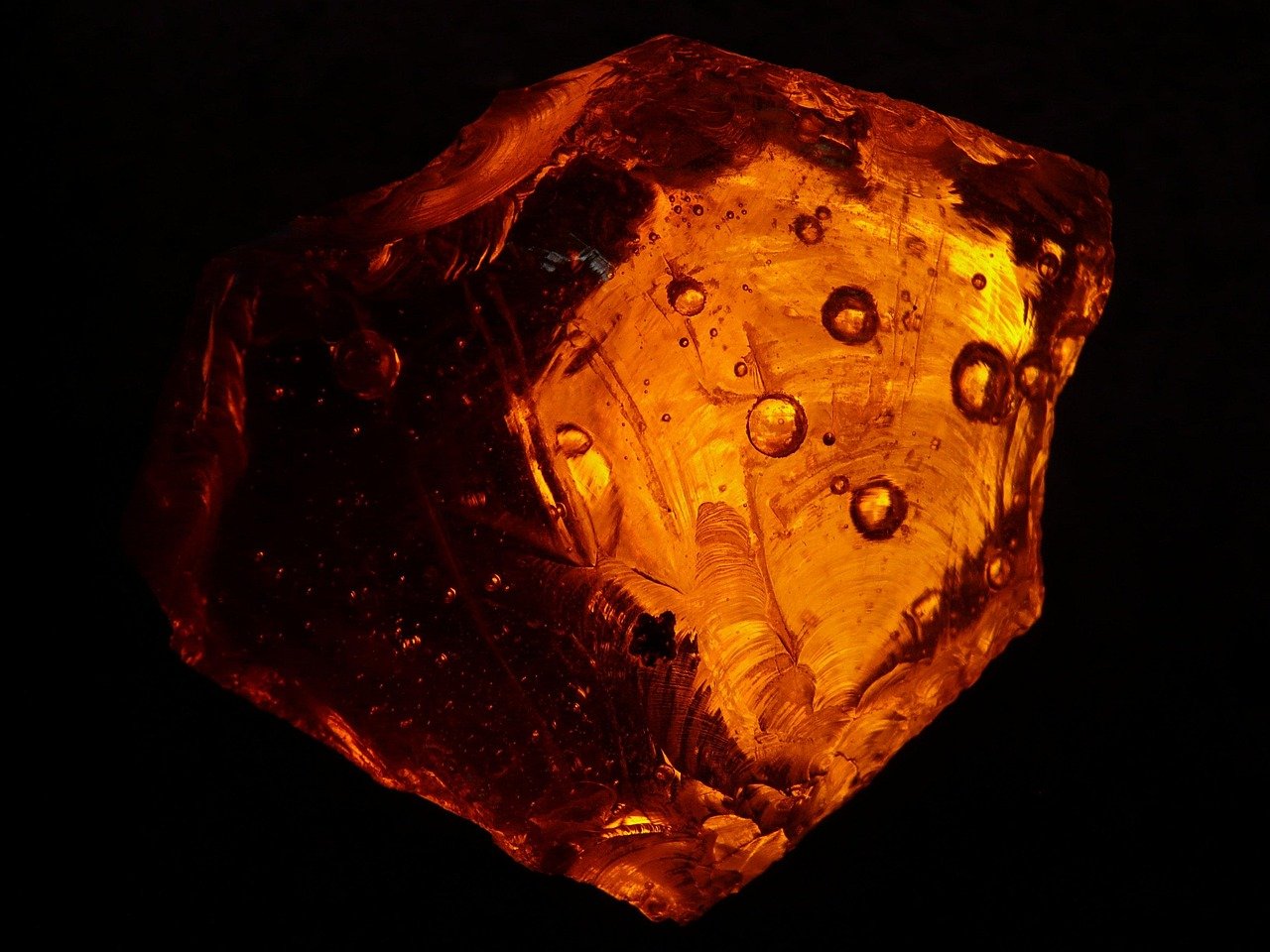
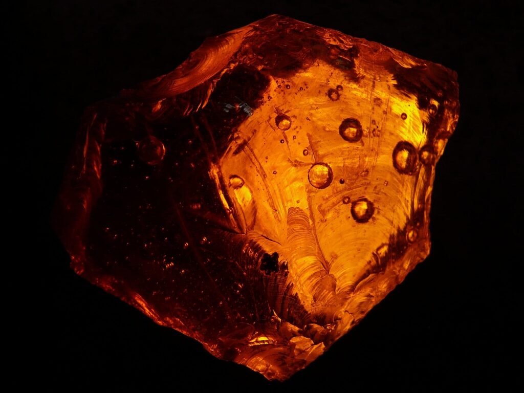
What do a traffic light, a glass of ale, a chunk of fossilised resin, and a missing-child alert have in common? They all borrow the name of one colour: amber. But here is the strange part. Ask five people to describe amber and you will get five different answers. One sees a deep honey orange. Another pictures a pale, almost lemon yellow. Someone else points at a hazard light on a truck. The word covers a surprisingly wide stretch of the colour wheel, and its story is tangled up with whales, Arabic trade routes, and a piece of medieval Latin that has nothing to do with gemstones at all.
This guide unpacks amber as a colour rather than a curiosity. It looks at where the name came from, how the hue shifts across contexts, where the term is standardised and where it is pure guesswork, and how to pick the right amber for a design or a dye pot without getting burned.
Where the Word “Amber” Actually Comes From
Most people assume amber is named after the fossil resin. The truth runs the other way around, and it is a genuinely odd story.
The word travels through Old French ambre and Medieval Latin ambra, and both trace back to the Arabic ʿanbar. That Arabic term originally meant ambergris, the waxy, foul-smelling substance produced in the digestive tract of sperm whales and once prized as a perfume fixative. The resin we now call amber was a separate thing. Over centuries, the two substances got tangled together in European usage, and the name migrated to the fossilised tree resin. The colour sense came later still, drawn from the resin’s warm glow.
So the colour amber is, linguistically speaking, named after whale matter that was later confused with tree sap. The exact dating of that semantic shift is debated among etymologists, so treat the timeline loosely. What matters for anyone using the word today is this: amber the colour is a borrowed descriptor, not a scientific classification. That borrowing is exactly why the hue refuses to sit still.
What Colour Is Amber, Really?
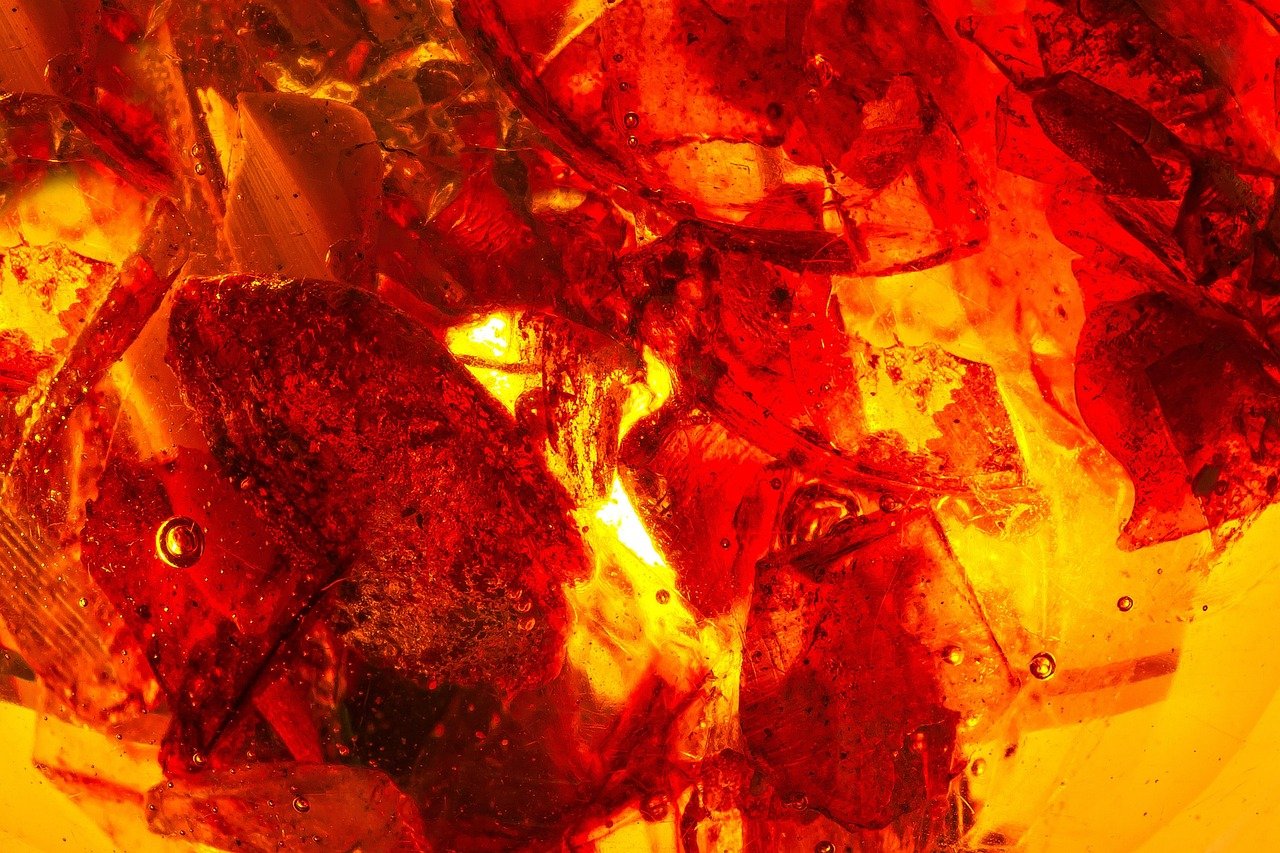
There is no single answer, and anyone who tells you otherwise is selling something. Amber is conventionally described as a warm orange-yellow, but the range is enormous. At one end sits a pale, buttery yellow. At the other, a brownish-orange deep enough to read as brown in low light.
Part of the confusion comes from the material itself. Natural amber resin varies wildly depending on where it formed and how it aged, so the colour name inherited that variability. Part of it comes from context. “Amber” on a beer menu means something noticeably darker than “amber” on a warning sign.
A useful way to think about it is as a band rather than a point. It sits between yellow and orange on the spectrum, leaning warm, with a strong association to translucency. When people say something is amber, they usually mean it glows rather than sits flat. That glow is hard to capture in a flat swatch, which is why amber paint chips often disappoint people who loved the gemstone.
Amber vs. orange vs. yellow: a quick comparison
| Context | Typical amber appearance | What it leans toward |
|---|---|---|
| Natural resin | Translucent honey to deep brown-orange | Warm, glowing, variable |
| Traffic signals (UK usage) | Strong yellow-orange | High visibility, standardised |
| Beer (amber ale) | Copper to reddish-orange | Mid-range on colour scales |
| Gemstone trade | Butterscotch, cognac, cherry | Informal, dealer-dependent |
| Web and design palettes | Usually a saturated orange-gold | Depends entirely on the palette |
That last row matters more than people expect. Amber is not a core named colour in CSS, the system that defines standard web colours. If a brand wants “amber” on a website, someone has to pick a hex value and defend it. That decision is aesthetic, not technical.
Amber in Traffic Signals: The One Place It Is Standardised
If you want to see amber treated with real precision, look at a road. In British and much of Commonwealth usage, the middle light in a traffic signal is called amber. In the United States, the same light is called yellow. Same job, different word.
The 1968 Vienna Convention on Road Signs and Signals provides for a yellow or amber change interval between green and red. National standards set the exact colour specification and timing, and those details genuinely differ between jurisdictions. This is why the amber you see in one country can look noticeably more orange than in another. The chromaticity requirements are not identical, and the duration of the change interval is a local policy decision with real safety consequences.
Here is the practical takeaway for anyone working with signage or vehicle lighting: never assume “amber” is a fixed specification. If a project involves warning lights, indicators, or signal heads, check the applicable standard for that jurisdiction rather than eyeballing a colour swatch. Amber in a design file and amber on a regulated light fixture are two different animals.
The same caution applies in aviation and marine lighting, where amber and yellow lights carry specific signalling meanings. Those specifications are set by international and national authorities, and the details vary. The colour is doing a job, not decorating.
Amber in Heraldry, Flags, and Formal Design
Amber is not a standard heraldic tincture. In heraldry, the established palette is a small, codified set, and amber usually gets folded into gold (or) or treated as a shade of tenné. Usage varies between traditions, so this is a general convention rather than a hard rule.
That tells you something useful. Amber has never been fully absorbed into formal colour systems. It lives in the space between gold and orange, and different traditions handle that gap differently. Designers who treat amber as a mood rather than a measurement tend to have an easier time with it.
Amber as a Trade Colour: Gemstones and Beer
Two industries use “amber” constantly and define it almost not at all.
In gemmology, amber descriptions run from butterscotch to cognac to cherry. These are trade descriptors, not standardised colour grades. Two dealers can describe the same stone differently and neither is lying. If you are buying amber, ask for photographs in neutral light and be suspicious of any listing that leans on a single evocative word.
In brewing, amber is a common descriptor for beer colour, sitting in the mid-range of the standard colour scales. Amber ales occupy a recognisable band, but the precise boundaries vary between style guidelines. A beer can be amber by one guideline and borderline by another.
The pattern across both industries is the same: amber is a shorthand that works in conversation and breaks down in contracts. That is not a flaw. It is simply what happens to a colour name that grew out of a material rather than a measurement.
Why Some Languages Have No Word for Amber
English treats amber as a distinct colour term, though whether it counts as a “basic” colour word is genuinely arguable. Many languages do not. They fold amber into yellow, orange, or brown, and speakers of those languages see nothing missing.
This fits a broader pattern in linguistics. Basic colour terms tend to emerge in a rough order across languages, a framework proposed by Berlin and Kay in 1969 and refined and debated ever since. Amber, sitting awkwardly between two categories that most languages do name, is exactly the kind of colour that gets absorbed rather than labelled.
For writers and translators, this is a practical trap. Translating “amber” as a colour into a language without the term forces a choice between yellow and orange, and that choice changes the image. A translator who renders an amber sunset as merely yellow has flattened it.
A Note on AMBER Alerts
One frequent confusion is worth clearing up. The AMBER Alert system, which broadcasts emergency information about child abductions, is named after Amber Hagerman, not the colour. It was established in the United States in the late 1990s and 2000s and has been adopted in many countries. Exact founding dates and naming details vary by source, so check before publishing anything date-specific.
The visual association with amber or yellow signage is coincidental. The name is a proper noun and an acronym, and it has nothing to do with the hue.
Practical Tips for Working With Amber
Whether you are choosing a paint colour, building a brand palette, or dyeing fabric, a few habits save a lot of frustration.
- Test in the actual light. Amber shifts dramatically between daylight, warm indoor bulbs, and screen backlighting. A swatch that glows in a shop window can turn muddy in a hallway.
- Decide whether you want the glow or the hue. Translucent amber and flat amber are different design problems. Pigments rarely reproduce the gemstone’s inner light without help.
- Anchor it to a neighbouring colour. Amber reads as yellow next to red and as orange next to green. Place it deliberately.
- Check accessibility contrast. Warm mid-tone ambers are notorious for failing contrast ratios against white text. Darken the amber or lighten the text.
- Do not trust the word alone in a brief. Ask for a reference image or a numeric value. “Make it amber” has started more revision cycles than almost any other colour instruction.
Common mistakes people make
The biggest one is treating amber as a single colour rather than a family. The second is assuming that a colour named after a translucent material will work as an opaque flat fill. The third, and most expensive, is specifying amber for anything regulated, like a warning light or a signal, without checking the applicable standard. Amber in those contexts is a safety specification, and getting it wrong is not a matter of taste.
How Amber Fits With Other Warm Colours
Amber sits in a crowded neighbourhood. It shares territory with gold, honey, ochre, and burnt orange, and the boundaries between them are soft. Gold tends to be more metallic and yellow-leaning. Honey is lighter and sweeter. Ochre is earthier and duller. Burnt orange pushes further toward red and loses the glow.
If you are building a palette, amber works well as a bridge between yellow and orange, which is why it shows up so often in autumnal schemes, food branding, and anything that wants to feel warm without shouting. It also pairs naturally with deep browns and greens, echoing the resin-and-forest association that gave it its name.
For anyone working across hair and beauty colour charts, the same warm-family logic applies. Amber tones sit close to the golden and copper shades that show up in discussions of 2b hair and in the deeper, richer spectrum that comes up with 4c hair. The principle holds across contexts: warm mid-tones read differently depending on what surrounds them and how light moves across them. Even a styling reference like the row demonstrates how a single warm accent can carry an entire look when the surrounding tones are chosen with care.
Conclusion
Amber is one of those colours that rewards a little scepticism. Its name arrived by accident, borrowed from a whale product and pinned to a tree resin, and the colour sense followed centuries later. It has never been fully standardised, which is why it means a honey glow in one room and a regulated signal in another. That looseness is not a weakness. It is what makes amber useful as a descriptive word and unreliable as a technical one.
The practical rule is simple. When amber is doing a job, like a traffic signal or a warning light, trust the standard and not the word. When amber is setting a mood, trust your eyes and test it in real light. And when someone asks you to “make it amber,” ask for a picture. You will save yourself an afternoon.
Frequently Asked Questions
What colour is amber exactly?
Amber is a warm colour that sits between yellow and orange, usually with a glowing or translucent quality. There is no single exact hue. It ranges from pale buttery yellow to deep brownish-orange depending on the context, and it is not defined as a standard coordinate in most colour systems.
Is amber the same as yellow or orange?
No. Amber overlaps with both but is distinct from each. It leans more orange than yellow and more yellow than orange, and it usually carries an association with warmth and translucency. In US traffic terminology, the light called amber in Britain is simply called yellow.
Why is amber called amber if it comes from whales?
The word comes from the Arabic ʿanbar, which originally referred to ambergris, a waxy substance from sperm whales. European usage gradually transferred the name to fossilised tree resin, and the colour term developed later from the resin’s appearance. The exact dating of that shift is debated.
Is amber a standard colour in web design?
Not in the core CSS named colours, which do not include amber. Some design tools and palettes offer an amber swatch, but the value varies between them. Anyone specifying amber for a website needs to choose and document an actual numeric value.
What is an amber alert and is it related to the colour?
An AMBER Alert is a child-abduction emergency broadcast system named after Amber Hagerman. It is a proper name and acronym, not a colour reference. Any visual link to amber or yellow signage is coincidental.
Why do languages differ on whether amber is a colour?
Many languages have no separate basic term for amber and fold it into yellow, orange, or brown. Basic colour terms tend to emerge in a rough order across languages, a framework proposed in 1969 and refined since. Amber sits between two categories most languages already name, so it often gets absorbed rather than labelled.