What do a 1977 perfume scandal, a flower that grows in disturbed soil, and a 2026 runway trend have in common? The poppy. More precisely, the strange, seductive pull of opium fashion — a loose visual language built on drowsy glamour, deep reds, lacquered black, and a whiff of forbidden indulgence. It is one of the fashion world’s most awkward inheritances, and it is quietly having a moment again.
This is not a story about drugs. It is a story about how a plant, a perfume, and a century of problematic imagery got tangled into a style vocabulary that designers keep reaching for — and what happens when that vocabulary meets a generation that reads history more critically than any before it.
What “Opium Fashion” Actually Means
The phrase has no official definition, which is exactly why it drifts. In practice, it covers three overlapping things:
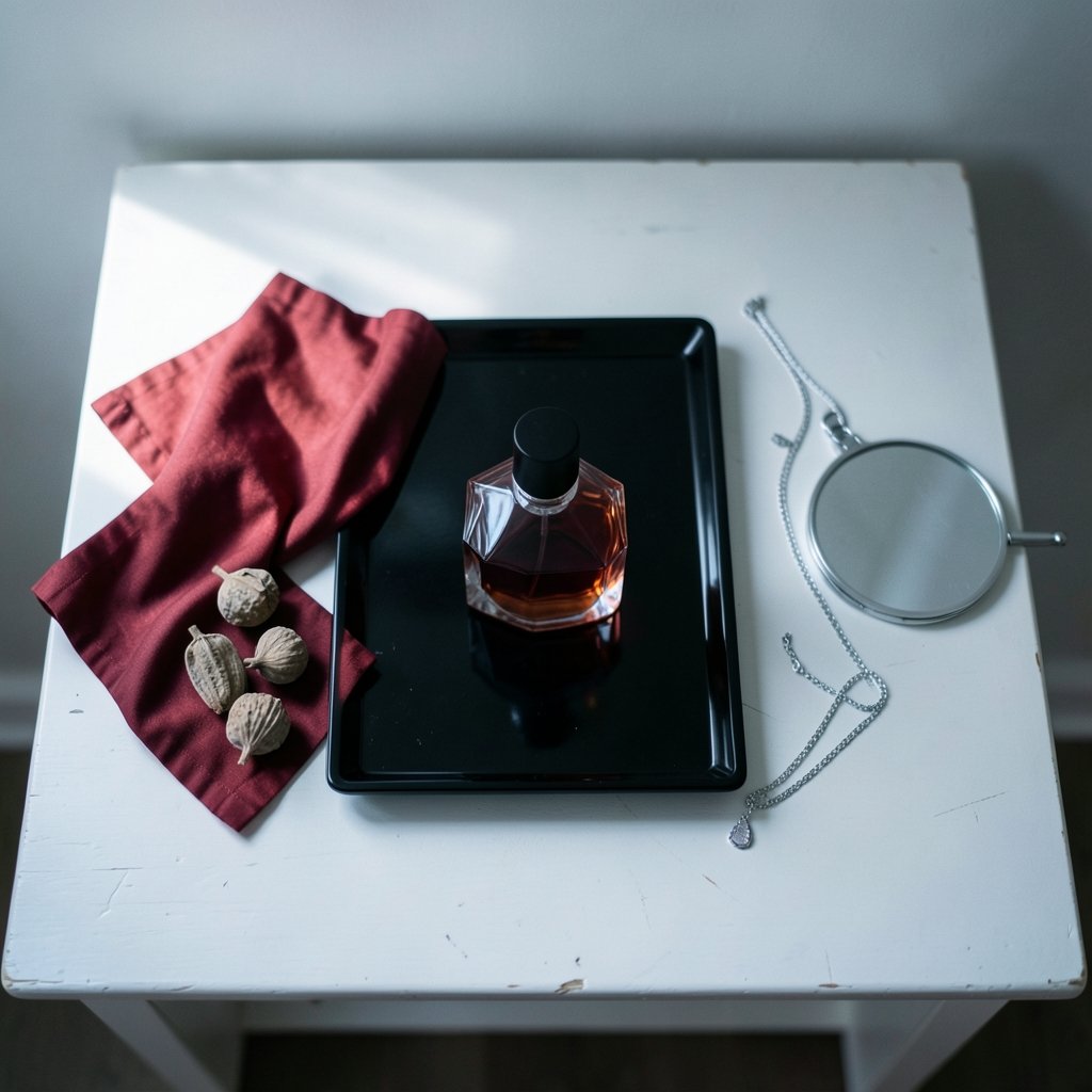
The perfume. A fragrance called Opium launched in 1977 and became one of the most commercially successful and most protested scents of its era. Its bottle — dark glass, a red tassel, an inro-inspired shape — became a design object in its own right. The name was the point: provocative, exoticized, deliberately scandalous.
The aesthetic. A mood board of opium-den imagery: low light, velvet, smoke, embroidered silk, jade, lacquer, deep crimson, and gold. It borrows heavily from 19th-century Western depictions of Chinese diaspora communities in port cities like San Francisco and London — depictions that were, more often than not, Orientalist fantasies rather than observations.
The botanical motif. Poppy flowers and seed pods rendered in embroidery, print, and jewelry. Art Nouveau designers used poppy forms repeatedly, and the flower’s association with sleep and oblivion made it a natural symbol for moody, romantic collections.
These three strands get flattened into one search term. That flattening is where both the appeal and the trouble live.
Why the Look Keeps Coming Back
Fashion has a long, documented appetite for styles that borrow from cultures without crediting them. The 2010s were a masterclass in this: as 2010s fashion, athleisure and streetwear rewrote the rules via Instagram, designers raced to produce visually arresting, shareable imagery — and “exotic” references photographed beautifully. The opium aesthetic is, visually speaking, extremely photogenic. Smoke, silk, and saturated red read instantly on a screen.
There is also a structural reason. Fashion cycles on contrast. After years of clean minimalism and neutral palettes, the pendulum swings toward ornament, texture, and drama. Opium imagery is the opposite of quiet luxury: it is loud, tactile, and theatrical. That makes it a reliable reset button for designers tired of beige.
And then there is the perfume effect. Fragrance houses have long understood that a name with a little danger sells. Once a single product proves that transgression moves units, the surrounding visual language becomes a permanent part of the industry’s toolkit.
The 2026 Version Looks Different
If you search for 2026 fashion trends right now, you will find poppy reds and deep oxbloods near the top of most color lists. That is not a coincidence. The current iteration of opium fashion has been detoxified — mostly.
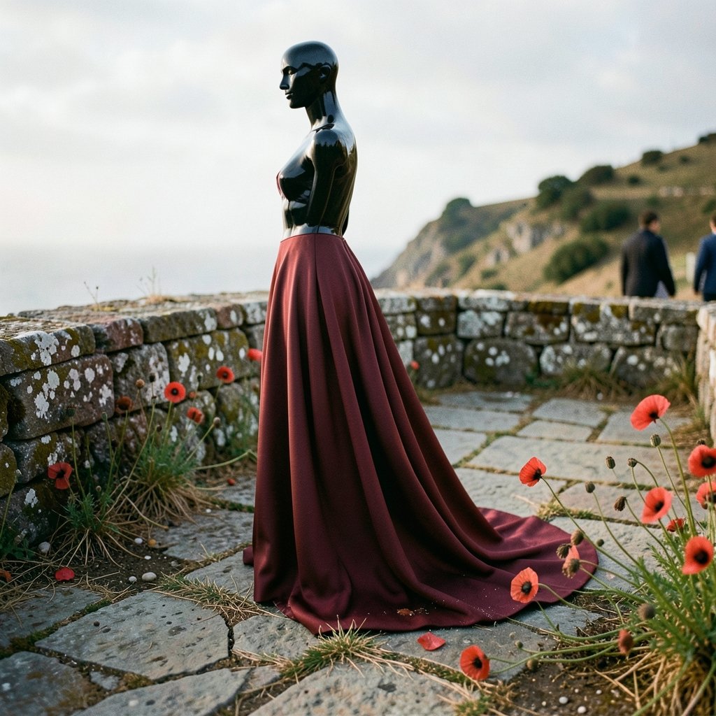
The 2026 take strips out the literal drug references and keeps the sensory parts: saturated red, dark lacquer finishes, heavy embroidery, tassels, jade green accents, and a silhouette that feels languid rather than sharp. Designers are leaning into texture over theme. Think a silk slip with a hand-embroidered poppy at the hem, not a costume.
A broader 2026 fashion trends guide would tell you the same thing from a different angle: this is a season about materiality. Fashion is rewarding things you can feel — velvet, satin, beaded trims — and the opium palette happens to be built almost entirely from those materials.
The runway-to-illustration pipeline has amplified it too. As Angelica Hicks turns runway moments into drawings with a few witty lines, the most meme-able looks get a second life. A red tassel and a lacquered bottle are, conveniently, very easy to draw.
The Sourcing Problem Nobody Talks About
Here is where practical advice matters more than trend commentary. If you want to wear this aesthetic, you will hit a wall fast: the materials that make it work are among the hardest to source responsibly.
Silk, velvet, and hand embroidery are the backbone of the look. All three have supply chains with well-documented labor and environmental concerns. Buying cheap versions of these fabrics usually means buying the worst versions of them — thin satin that photographs well and feels terrible, embroidery done under conditions nobody wants to inspect.
What actually works in practice:
- Buy vintage first. The 1970s and 1980s produced enormous volumes of this aesthetic, in genuine silk and real beading. It already exists. Wearing it again is the single most sustainable move available.
- Check the fiber label, not the brand story. “Silk-feel” means polyester. If a listing will not state fiber content, assume the worst.
- Look for deadstock trim. Tassels, braid, and beaded appliqués from closed factories are widely available and cheap.
- Buy one good piece instead of five cheap ones. A single well-made velvet jacket outperforms a closet of synthetic imitations, and it will still be wearable in a decade.
The most common mistake is treating this as a costume. Costume versions of opium fashion — think Halloween-adjacent — look dated instantly because they rely on props. The wearable version relies on color and texture only.
Where the Aesthetic Borrows and Where It Crosses a Line
This is the part that requires honesty. The opium aesthetic sits directly on top of a century of Western imagery that caricatured Chinese people and communities. Opium dens were a real feature of port-city life, and they were also a journalistic obsession that fed racist stereotypes and, in some places, punitive legislation.
That history does not disappear because a fabric is beautiful. But it does mean the line between homage and appropriation is worth learning to see.
| Element | Generally fine | Requires care |
|---|---|---|
| Color palette | Poppy red, oxblood, jade, black lacquer | None — colors belong to everyone |
| Materials | Silk, velvet, embroidery, tassels | Check labor and environmental sourcing |
| Botanical motifs | Poppy print, seed-pod jewelry | Avoid drug-glamourizing styling |
| Silhouettes | Robes, wraps, fluid layers | Credit the originating garment tradition |
| Styling props | None needed | Fake opium pipes, “den” sets — skip entirely |
The practical rule: borrow the craft, credit the source, skip the props. A poppy-embroidered robe is a garment. A staged den photoshoot is a costume of someone else’s history.
The same logic applies elsewhere in fashion. Consider how the Barbie world tour book turned a movie into a fashion story — the styling worked because it was specific and intentional, not because it borrowed vaguely from “elsewhere.” Specificity is what separates design from pastiche.
How to Wear It Without Looking Like a Theme Party
If you want to try this look, start narrow. The people who get it right almost always do.
Pick one anchor. A deep red silk shirt. A velvet blazer in oxblood. A single piece of poppy-embroidered jewelry. Build the rest of the outfit from plain, modern basics — straight-leg denim, a white tee, a black trouser. The contrast is what makes it read as style rather than costume.
Stay close to the body’s natural lines. The aesthetic’s drama comes from fabric and color, not volume. A fluid bias-cut skirt in heavy satin does more than a full period gown.
Use gold sparingly. One piece of jewelry, one hardware detail. Gold against deep red is the whole trick; more than that and it tips into theatrical.
Skip the smoke. Literally. Fog machines, tinted glasses, and moody props are what make this look dated. The modern version is worn in daylight.
For anyone tracking where the wider trend cycle is heading, the Italian luxury fashion houses have been the clearest signal: several have quietly reintroduced poppy motifs and lacquer-finish leathers in recent collections, framed entirely around craft rather than provocation.
The Perfume Question
Should you wear the fragrance? That is a personal call, and it comes with context.
The scent itself is a heavy, spicy oriental — clove, cinnamon, amber, and a dense floral heart. It is unmistakably of its era, and it still sells. But the name carries baggage that has only become more visible over time, and some people find it uncomfortable to wear in public.
If the name bothers you, the aesthetic is easy to get elsewhere. Modern houses have released dozens of spicy amber fragrances that deliver the same sensory effect without the historical wink. The smell was never the scandal; the marketing was.
A Note on Reading Trend Coverage
Fashion media is very good at making a trend feel inevitable. It rarely is. Before you buy into any revival, it helps to know who is doing the reporting and how. If your main source of trend information is a crowded inbox, it is worth learning how to find the best fashion substacks without wasting your inbox — independent writers tend to flag sourcing and cultural questions that brand-owned channels skip entirely.
That matters more with a topic like this one, where the visual appeal and the historical record pull in different directions. A trend post will show you the color palette. It will rarely tell you where the imagery came from.
Conclusion
Opium fashion is a useful case study in how fashion handles difficult material. The visual language is genuinely beautiful — the reds, the silk, the poppies, the lacquer. It is also built on borrowed imagery that flattened real communities into a mood.
The 2026 version is better than its predecessors, mostly because it has dropped the props and kept the craft. That is the right direction. Wear the color, wear the embroidery, buy the vintage, credit the tradition, and leave the den in the past where it belongs. The look survives without the scandal — and honestly, it looks better that way.
What is opium fashion?
It is a loose style vocabulary built on imagery associated with 19th-century opium dens, plus the 1977 fragrance that popularized the name. In practice it means deep reds, lacquered black, silk and velvet, embroidery, tassels, jade accents, and poppy motifs. It is a mood and a palette rather than a defined garment category.
Is it appropriate to wear opium-inspired clothing?
Wearing the palette, fabrics, and botanical motifs is generally considered fine. The problems come from props and framing — fake opium pipes, staged “den” sets, or styling that glamourizes drug use. Borrowing craft is different from borrowing someone else’s history as a costume.
Why was the Opium perfume controversial?
The fragrance launched in 1977 with a name and marketing campaign that deliberately courted shock by referencing drug use. It drew protests and criticism at the time, and the controversy became part of the product’s identity. The scent itself is a heavy spicy oriental and still sells decades later.
What colors define the opium aesthetic?
Poppy red, oxblood, deep crimson, lacquered black, jade green, and gold. These are the core tones, and they work because they are saturated and high-contrast. In 2026 the palette has merged with the broader trend toward rich reds and dark, glossy finishes.
How can I wear it without looking like I’m in costume?
Pick one anchor piece — a red silk shirt, a velvet blazer, a poppy-embroidered accessory — and pair it with plain modern basics like denim or a white tee. Keep silhouettes close to natural body lines, use gold sparingly, and skip props entirely. The fabric and color should do the work.
Where should I buy opium-inspired pieces?
Vintage first. The 1970s and 1980s produced huge volumes of this aesthetic in genuine silk and real beading, and buying it again is the most sustainable option. If buying new, check the fiber label rather than the marketing copy, and prefer one well-made piece over several synthetic imitations.